Plots
The plots module contains plotting functions for Curveball.
Functions that plot growth data expect a pandas.DataFrame generated by the ioutils module.
Functions that plot the results of growth model fitting often expect the result of the fitting - one or more lmfit.model.ModelResult objects.
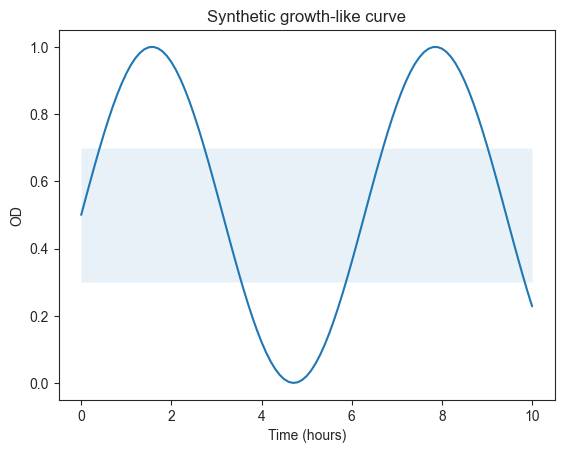
Example
Members
- curveball.plots.plot_model_residuals(model_fit, rv=<scipy.stats._continuous_distns.norm_gen object>, color='k')[source]
Plot of the residuals of a model fit.
The function will plot the residuals - the difference between data and model - for a given model fit. The left panel shows the residuals over time; the right panel shows the histogram of the residuals with a fitted distribution curve.
Parameters
- model_fitlmfit.ModelResult
the result of a model fitting procedure.
- rvscipy.stats.rv_continuous, optional
scipy.stats.rv_continuousrandom variable whose probability density function (pdf) will be fitted to the histogram. Defaults to the normal distribution (scipy.stats.norm).- colorstr, optional
color string for the plot, defaults to k for black.
Returns
- figmatplotlib.figure.Figure
figure object
- axnumpy.ndarray
array of axis objects.
- curveball.plots.plot_params_distribution(param_samples, color='k', cmap='viridis', alpha=None)[source]
Plots a distribution of model parameter samples generated with
curveball.models.sample_params().Parameters
- param_samplespandas.DataFrame
data frame of samples; each row is one sample, each column is one parameter.
- alphafloat
transparency of plot markers, defaults to \(1/n^{1/4}\) where n is number of rows in param_samples.
Returns
- seaborn.Grid
figure object
- curveball.plots.plot_plate(data, edge_color='#888888', output_filename=None)[source]
Plot of the plate color mapping.
The function will plot the color mapping in data: a grid with enough columns and rows for the
ColandRowcolumns in data, where the color of each grid cell given by theColorcolumn.Parameters
- datapandas.DataFrame
growth curve data, see
curveball.ioutilsfor a detailed definition.- edge_colorstr
color hex string for the grid edges.
Returns
- figmatplotlib.figure.Figure
figure object
- axnumpy.ndarray
array of axis objects.
- curveball.plots.plot_residuals(df, time='Time', value='OD', resid_func=<function <lambda>>, rv=<scipy.stats._continuous_distns.norm_gen object>, color='k', ax=None)[source]
Plot of the residuals of in the data.
The function will plot the residuals - the difference between data and average at each time point. The left panel shows the residuals over time. The middle panel shows the histogram of the residuals with a fitted distribution (defaults to Gaussian). The right panel shows the regression between the standard deviation at time t+1 and t to identify autocorrelation.
Parameters
- dfpandas.DataFrame
a data frame with columns
TimeandOD.- timestr, optional
name of column over which to group and plot the residuals. Defaults to
Time.- valuestr, optional
name of column in df of the value on which to compute the residuals. Defaults to
OD.- resid_funcfunction, optional
function to calculate residuals. Defaults to
x - x.mean().- rvscipy.stats.rv_continuous, optional
scipy.stats.rv_continuousrandom variable whose probability density function (pdf) will be fitted to the histogram. Defaults the normal distribution (scipy.stats.norm).- colorstr, optional
color string for the plot, defaults to k for black.
Returns
- figmatplotlib.figure.Figure
figure object
- axnumpy.ndarray
array of axis objects.
- curveball.plots.plot_sample_fit(model_fit, param_samples, fit_kws=None, data_kws=None, sample_kws=None)[source]
Plot of sampled curve fits.
The function will plot the main model fit and the sampled curve fits based on a table of sample parameters.
Parameters
- model_fitlmfit.ModelResult
the result of a model fitting procedure.
- param_samplespandas.DataFrame
data frame of samples; each row is one sample, each column is one parameter.
- fit_kws, data_kws, sample_kwsdict
dictionaries of plot directives for the fit, data, and sampled fit curves.
Returns
- figmatplotlib.figure.Figure
figure object
- axnumpy.ndarray
array of axis objects.
- curveball.plots.plot_strains(data, x='Time', y='OD', plot_func=<function plot>, by=None, agg_func=<function mean>, hue='Strain', color=None, output_filename=None, **kwargs)[source]
Aggregate by strain and plot the results on one figure with different color for each strain.
The grouping of the data is done by the
Strainand eitherCycle Nr.orTimecolumns of data; the aggregation is done by the agg_func, which defaults tonumpy.mean(). The colors are given by theColorcolumn, the labels of the colors are given by theStraincolumn of data.Parameters
- datapandas.DataFrame
growth curve data, see
curveball.ioutilsfor a detailed definition.- xstr, optional
name of column for x-axis, defaults to
Time.- ystr, optional
name of column for y-axis, defaults to
OD.- plot_funcfunc, optional
function to use for plotting, defaults to
matplotlib.pyplot.plot()- bytuple of str, optional
used for grouping the data, defaults to
('Strain', 'Cycle Nr.')or('Strain', 'Time'), whichever is available.- plot_funcfunc, optional
function to use for aggregating the data, defaults to
numpy.mean().- colorseaborn color palette
a seaborn color palette to use if there is no
Colorcolumn; if not given, using the default palette.- output_filenamestr, optional
filename to save the resulting figure; if not given, figure is not saved.
Returns
- seaborn.FacetGrid
figure object.
Raises
- ValueError
raised if by isn’t set and data doesn’t contain
Strainand eitherTimeorCycle Nr..
- curveball.plots.plot_wells(df, x='Time', y='OD', plot_func=<function plot>, output_filename=None)[source]
Plot a grid of plots, one for each well in the plate.
The facetting is done by the
RowandColcolumns of df. The colors are given by theColorcolumn, the labels of the colors are given by theStraincolumn. IfStrainis missing then the coloring is done by theWellcolumn.Parameters
- dfpandas.DataFrame
growth curve data, see
curveball.ioutilsfor a detailed definition.- xstr, optional
name of column for x-axis, defaults to
Time.- ystr, optional
name of column for y-axis, defaults to
OD.- plot_funcfunc, optional
function to use for plotting, defaults to
matplotlib.pyplot.plot()- output_filenamestr, optional
filename to save the resulting figure; if not given, figure is not saved.
Returns
- seaborn.FacetGrid
figure object.
- curveball.plots.tsplot(data, x='Time', y='OD', ci_level=95, ax=None, color=None, output_filename=None, **kwargs)[source]
Time series plot of the data by strain (if applicable) or well.
The grouping of the data is done by the value of x and
Strain, if such a column exists in data; otherwise it is done by x andWell. The aggregation is done byseaborn.lineplot()which calculates the mean with a confidence interval. The colors are given by theColorcolumn, the labels of the colors are given by theStraincolumn; ifStrainandColordon’t exist in data then the function will use a default palette and color the lines by well.Parameters
- datapandas.DataFrame
growth curve data, see
curveball.ioutilsfor a detailed definition.- xstr, optional
name of column for x-axis, defaults to
Time.- ystr, optional
name of column for y-axis, defaults to
OD.- ci_levelint, optional
confidence interval width in precent (0-100), defaults to 95.
- axmatplotlib.axes.Axes, optional
plot into this axes, if not given create a new figure.
- colorseaborn color palette
a seaborn color palette to use if there is no
Colorcolumn; if not given, using the default palette.- output_filenamestr, optional
filename to save the resulting figure; if not given, figure is not saved.
Returns
- matplotlib.axes.Axes
axes object